
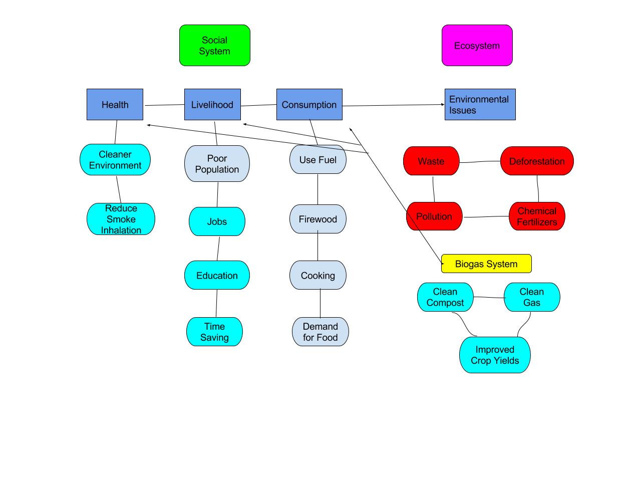
In my diagram I tried to show what the people were doing in their lives and the impact this was having on the environment. Prior to the installation of a Biogas system the people and environment were not in cohesion. People took what they needed from the environment and their lives were hard. They couldn’t worry about the environment because they were focused on surviving. This wasn’t good for the local population or the ecosystem. The situation with a Biogas system looks like a positive feedback loop. The loop started when people began composting, which turned their waste into something beneficial. This improved crop yields and these extra crops will create more waste than before. The waste is also providing jobs to locals and the farmers should have more income from their increased crop yields. With more money in the local economy consumption should rise, thereby creating more waste in the future and continuing the loop.
My diagram is similar to 1.5 in that we have both broken it into two main categories (Social System and Ecosystem). Our diagrams also both show the interconnectedness between the social system and ecosystem. There are many differences most notably that my diagram focuses on a broader view. The books diagram is a little more specific and focuses on the small problems and positives within the system. I think that there are similarities and differences because we are both trying to illustrate an interconnected system but took slightly different approaches. By looking at both diagrams you can see both the large issues and the small drivers of those issues.
Hello Chris!
I appreciate the color uses in your diagram, it instantly caught my attention, which is one reason I chose to comment on your post. I appreciate the simplicity of the diagram. The positive affects are clearly shown in blue, and the negative effects of the wood burning loop are red. These simple choices make for better understanding. If I could offer some positive criticism, I would suggest making sure the lines done cross through the component bubbles. Another cool idea would be to make the green social system component as a background for all of the social system components, and the same with the ecosystem one.
Anyway. great job Chris! Here is a link to my post if you’d like to see it;
https://wp.me/p3RCAy-bbb
Hi Chris. My name is Aaliyah here is the link to my blog https://wp.me/p3RCAy-baT. I think the perspective you took was interesting. Showing a before and after emphasizes the improvement in stability the biogas created. My graph, like yours, shows the social and economic systems broken off into two categories. However, I chose to focus on the improvements made in relation to the money generated by the biogas.
http://geog030.dutton.psu.edu/2016/01/27/blog-post-2-pavelko-fox/
Hi Chris, my name is Matt. I like the use of a lot of color in your graph, I tried using the same approach too and I think it makes the illustration easier to follow. I agree that bio gas is a great energy alternative. In a country who’s population is exponentially growing it is a cheap and relatively easy solution to the problem.
http://geog030.dutton.psu.edu/2016/01/27/blog-post-2-pavelko-fox/