
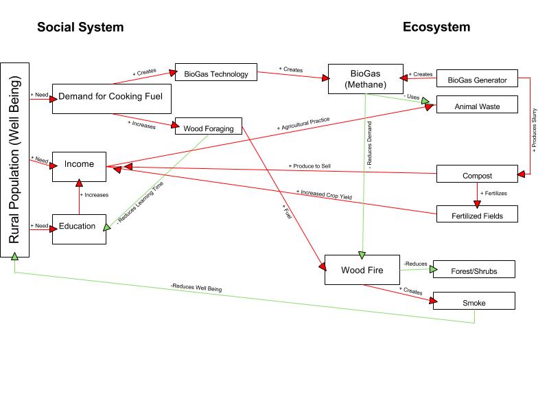
This Village Social and Ecosystem Diagram visually separates each system into its main influential components and then to their own components. The diagram’s focus is on how cooking in rural India impacts the system. Demand for Cooking Fuel, for example, is broken down into the two “solutions” given in the video: BioGas technology and Wood Foraging. These two social components both effect their ecosystem differently. This shows how one component can create positive and negative feedback depending on how it approaches the subsequent result. Biotechnology reduces the need for wood fire to cook; wood foraging only supplies the fuel. Red lines help to differentiate a positive (additive) impact/feedback from negative (subtractive) which is indicated in green.
This diagram was extracted from one source, which shows a bias toward BioGas Generators as it disregards any unwanted effects they may incur (and therefore, the diagram does not display them). Gerry Marten’s diagram also disregards these aspects. His diagram responds more to the population as a number, and the influence cooking fuel demand increases it. My diagram adheres more to the educational repercussions than the number of rural children due to wood foraging for fire fuel. Marten’s diagram uses arrows to show the resources that one component provides to another, where as the arrows in mine indicate impacts.
Megan, your diagram is laid out very differently than mine which is why it caught my interest. I read yours as left to right unlike mine which is vertical. I thought it was interesting how the diagram starts with the well being of the rural population, then to their issues/problems, then the two solutions. One would be wood foraging, the other biogas technology. It was interesting how you put the effects of both solutions. I also liked how the top cycle is the better solution and you showed that with the red additive arrows. Good diagram! Here’s a link to mine http://geog030.dutton.psu.edu/2016/01/25/biogas-diagram-nicolina-dimascia/