
In my diagram, the green sentences highlight the effects of biogas on the ecosystem and the blue sentences highlight the effect of biogas on the social system. The core idea behind this diagram is of coexistence. It describes the concept of landscape i.e how environmental and human phenomena co-exist. It also gives an idea of the IPAT equation. The diagram shows how different effects on different aspects of the ecosystem transition into different effects on different aspects of the social system. For example : the introduction of biogas plant (human impact) reduces the time of cooking and as well as reduces air pollution leading to more time for women to have a job at the vermicomposting unit and a safer environment to cook as well (environmental impact). So the positive human impact has a positive environmental impact making the IPAT equation hold.
While comparing Gerry Marten’s diagram (Fig 1.5) to my diagram I realized that most of it explains the same basic ideas. He talks about how introduction of technology transitions into a positive impact on the ecosystem I have done the same saying how using different resources increases productivity and saves the environment. However one of the major differences is he has given headings and I have given explanations of the transitions. I have talked about saving time and improving health, whereas his diagram talked about the knowledge it took to come up with this idea and values of public in society. The similarities and differences are there because his diagram is about ecosystem and social system as a whole i.e a broader sense of balance between the systems while mine talks only about the effects of biogas on the systems and their relations. Through the comparison I have learnt that the society can grow and improve only as a whole as both the ecosystem and social system go together hand in hand.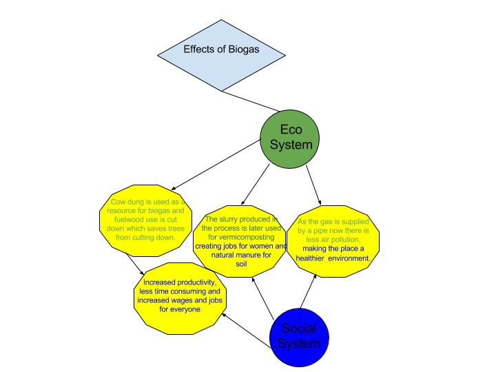
Akiksha,
Your diagram is very visually descriptive! You highlight the impact of the change of fuel from wood to biogas so that the viewer can see them at a glance. My diagram focused more on the interactive processes whereas yours focuses on results.
Your diagram is an original approach.
Mike Evangelista
http://geog030.dutton.psu.edu/2016/01/27/module-2-effect-of-biogas-generators/