
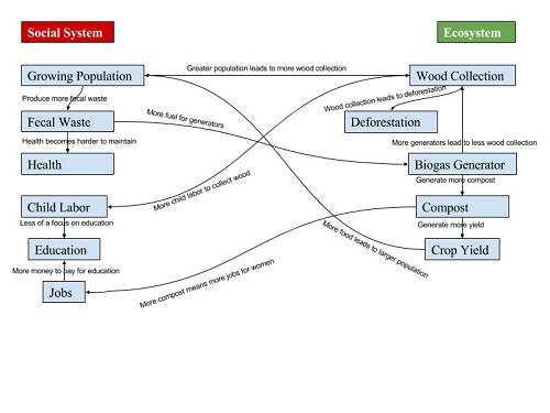
My diagram is split up into two main systems, the Social System and the Ecosystem. The Social System is composed of Growing Population, Fecal Waste, Health, Child Labor, Education, and Jobs. The Ecosystem is composed of Wood Collection, Deforestation, Biogas Generator, Compost, and Crop Yield. While each of these components falls under the Social System or Ecosystem, they are all interconnected by the effects of having a Biogas Generator in the Ecosystem. The main flow of my graph is that with a greater population comes greater wood collection and deforestation. Children are the primary collectors of this fuel source so child labor increases and and education falls. With a Biogas Generator, there is less wood collection and therefore an increase in education. It always creates more compost and therefore better crop yields. In the end, it leads to a positive feedback system by producing greater but healthier population and starts to go back into the same cycle.
Compared to Figure 1.5 in What is Human Ecology, my diagram has some similarities as well as some differences. The most obvious difference that one would notice right away is that Figure 1.5 much more of a cycle between Social System and Ecosystem while mine bounces back and forth between the two a lot. I think this could be the cause of more of a design choice on my end and I could probably focus a little more on making it cyclistic, but I thought the way I designed it was good as well. The similarities is that the differences between my systems are well defined. There is no component that could go in either one system or the other, just like Figure 1.5. These similarities and differences exist because of what I chose to focus on as my components. A system can be as small or as big as the designer wants and that will greatly affect how cyclistic the figure is, as well as how interconnected all the components are. The way that I chose to design mine could have focused on different components to make it more similar to Figure 1.5. I think what you can really take away from this is that there are a lot of different components to focus on when making a figure like this. It can really change the look and the impact it has on a reader; it is definitely something that the designer should be aware of when creating one.
Hi my name is Alexis! I found it very interesting how you mentioned that the growth in population creates more waste, which falls into a chain reaction of events that can eventually harm the health of humans. In the diagram I produced I mentioned how human health is effected by not only waste but by also the resources used to cook their meals everyday. The connection between both systems within our diagrams are the same, which means the end result is beneficial. I also thought your diagram was very organized and easy to follow. Check out mine at https://wp.me/p3RCAy-b3X.
I really like your analysis in the first paragraph. Everything has a relationship another. When the BioGas generator was introduced, everything was flipped for the better. I guess in the end, the tech revolution in the city did some harm and a lot of good when it comes to the generator.
Also your graph is really clean and organized and I’m mad mine isn’t.
also, check out my blog post! Pretty similar http://geog030.dutton.psu.edu/2016/01/26/module-2-biogas-in-india-tyler-brackbill/