
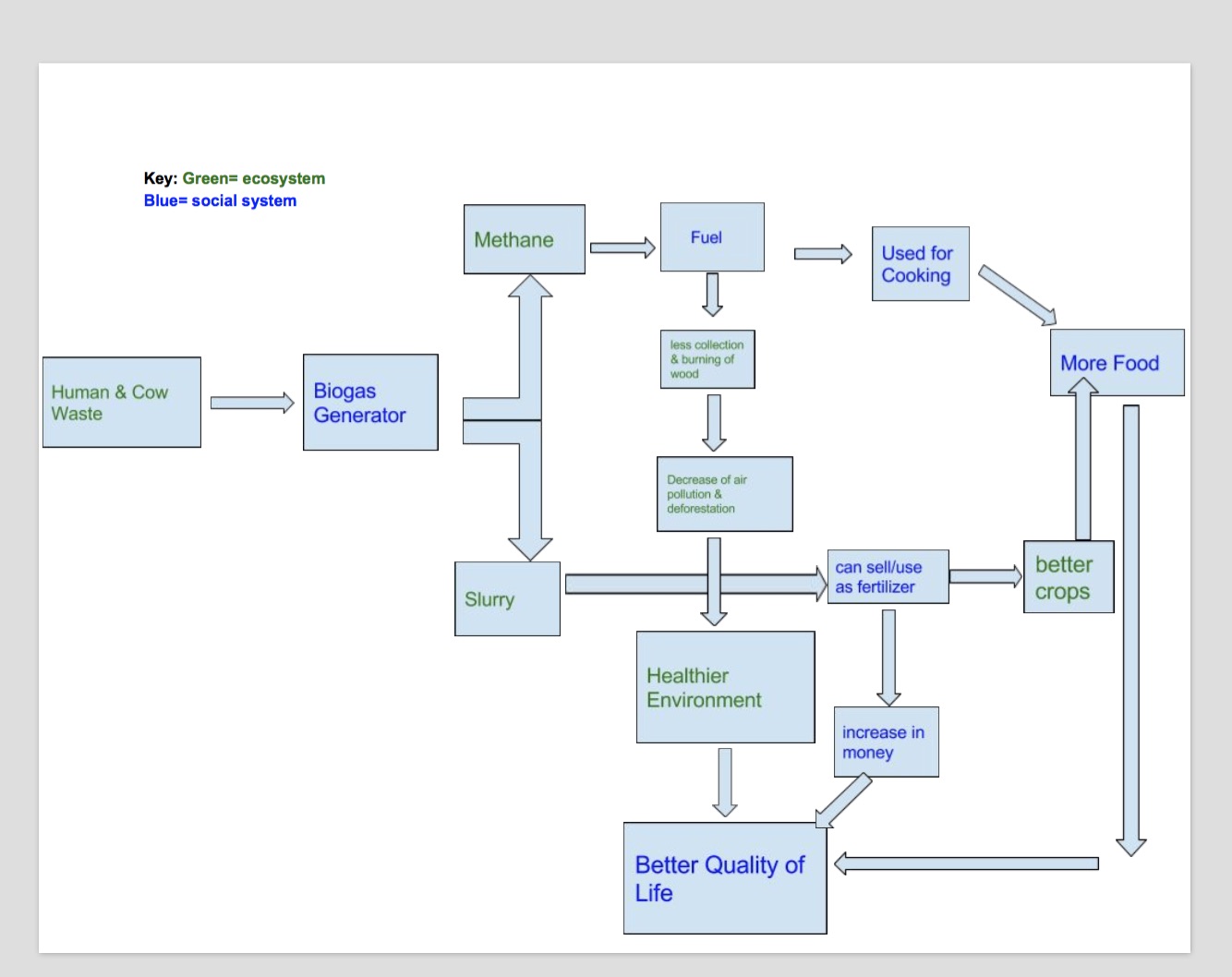
For my diagram I really wanted to emphasize the human-environment relationship in this situation. I color coded each block to show whether it is an element from the environment and plays a part in our ecosystem, or whether it is human related and affecting the social system. I designed my concept map to be as easy to read as possible. It begins with the starting element of cow and human waste, is directed with an arrow to show its put into the biogas generator and the arrows show the two products that come out of the generator ( methane and slurry). I then used the arrows to show the effects of each product and how it ultimately all leads to a better quality of life for these people. This technology is great. As you can see in the map there are a few feedback mechanisms that are effected. For example, by using the methane fuel a negative feedback is creating because now less and less trees will be need to cut down. All in all the biogas generator is a positive impact on the people of India by creating an effective and stable system.
My diagram and Gerry Marten’s diagram are similar in the sense that they both generally illustrate the relationships between different elements in each system. However they do differ a lot. Marten’s diagram is much more complex in its webbing and uses a ton of arrows to show how many elements are connected. His diagram also uses more general terms where as mine is very specific to the situation in India. They most likely are similar because we are creating a map of similar topics (ecosystem and social system relations). They differ because his map is more of a general concept illustrating human ecology where as my map is illustrating one specific human-environment system so it is much more specific. We can learn from Marten’s map that generally all things in a system effect each other and we can take this into consideration when thinking about the specific biogas generator system and see that it follows this same idea.
Hi Christianna, I really enjoyed how you color coded your diagram. It really made it easy and understandable to read. Your diagram was very neat and very nice looking which is good. I really like how you used the term negative feedback because that was harder for me to understand, but with your example I definitely understand more than I did before. I definitely agree with you in the fact that your diagram is similar to Marten’s. I think all of ours are like that, but I think we each have our own individual ideas that make our own concept map. Here is my post if you’d like to check it out: http://geog030.dutton.psu.edu/2016/01/26/module-2-biogas-in-india-4/.
Hi, my name is Gershom Espinoza and your diagram as well as you explanations were well thought out because it was simple, comprehensible and straight to the point. Though I didn’t explicitly state it in my diagram, my approach is looking at the human aspect of it as well. Also, great retention of terms in your speech because lets just say…I remember the gist of them. Another thing of note is the role our counties, states and countries have in using resources because it is done (or “supposed” to anyway) in the collective interests of everyone. For example, the regulatory structure of fisheries on either coast is meant to be as good for the locals as possible while at the same time ensuring that preservation of resources are in place and non-coastal states to be able to still get their “seawater” fish. (Personally, I wouldn’t eat seawater fish if I was in the middle of the country)http://geog030.dutton.psu.edu/2016/01/27/module-2-gershom-espinoza/
Hello Christianna!
You had already replied on mine… but anyways (for the sake of grading purposes): http://sites.psu.edu/geog30/2016/01/27/biogas-system-…le-2-bernstein/ – hopefully that link works – the links have been giving me trouble all night.
First off, I must say that I really enjoy your diagram – the steps you outlined and the conclusion (the most important part) all summed up the video nicely. I also agree with you on Marten’s diagram. Marten’s diagram seemed somewhat one-sided to me (focusing largely on the social aspects), so I appreciate how you represented the eco and social sides evenly. I just wanted to end by saying that you had achieved your goal with your diagram: ” I designed my concept map to be as easy to read as possible. ” Simple and informative – great job!