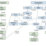
When considering the topics from module two, I think about the types of feedback loops and how they are incorporated in my diagram. Examples of positive feedback loops occur when more money leads to more education, which leads to more technology. These are both good things for any social system. Also, more cows produce to more dung, which can be combined with water to make more slurry. The slurry makes more methane gas for cooking, and compost, which can be sold for money. Examples of negative feedback loops occur when the methane gas is used for cooking, which reduces smoke and infection in humans and the environment.
Making methane gas and using it for fuel is much more sustainable than cutting down trees, and wasting time gathering wood. Dung from livestock will always be available, so there will always be a source of energy to cook with. This is very important, especially in developing nations and nations with large populations.
There are several similarities between my diagram and the Marten diagram from the reading. They include population, knowledge/education, and technology on the social systems side, and plants, animals, and water on the ecosystem side. Differences include more detailed breakdowns of what each of those similarities produce. These differences occur because my diagram is about a specific human invention, whereas Marten’s is about the basic interaction. We can learn that each of the interactions listed in Marten’s diagram have many additional parts that make the relationships much more complicated.


Hi Alex, my name is Kelsey and here is a link to my post if you wanted to check it out: http://sites.psu.edu/geog30/2016/01/27/module-2-kelsey-shoepe/
Looking at your diagram I noticed that ours were pretty similar. I also used the different colors for the different parts of the chart in hopes it would make it easier to pick about what connected to what. I really liked your post because it was extremely similar to mine. It was clear that you understood the material and used everything in the appropriate context as well as not over analyzing the material.
Hi Alex, I’m Siying and here’s the link to my post: http://geog030.dutton.psu.edu/2016/01/27/biogas-in-india-4/
I like the way you draw your system diagram, it’s a great idea to use different colors to represent different categories! And the diagram shows the information effectively as it uses simple words and arrows to show the relationship. I agree that using cow dung is a good way in less developed regions as they are easily accessible. And the concept of feedback loops is also well explained.