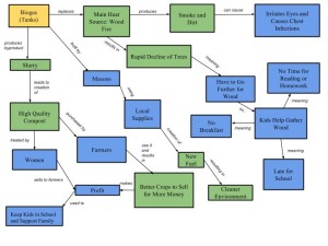
 The core ideas behind my diagram are to take a better look at the landscape in the sense of how the social and eco aspects of the Biogas (Tanks) are intertwined and to serve as an examination of their fluidity. To help simplify, I colored the Biogas (Tanks) box in yellow for a starting point; the ecosystem related boxes are green and the social ones are blue. All in all, I believe my system diagram done a decent job in demonstrating the human-environment interactions. My diagram in comparison to Gerald Marten’s is very different but with a few similarities. They are similar in that they both include (in one manner or another) fertilizer, crops, and the cutting of wood. They are different in that Marten’s diagram took the number of children in consideration and that they listed that the fuel was to be used for cooking – my diagram just has it listed as “New Fuel”. I believe one of the main reasons that our diagrams differ so much is the perspective we took. My perspective is more of a “big picture” and focuses on a little of everything, while Marten’s seems to favor the social/human side of the equation (albeit it in more detail). Having a second diagram to compare to allows me to view different interactions I overlooked when making mine: the gathering things to be buried, for example. Personally I believe that the more complete picture can be found using both the diagrams.
4 thoughts on “Biogas System Diagram (Module 2) – Bernstein”
Leave a Reply
You must be logged in to post a comment.

Hi, my name is Gershom and I couldn’t agree more on taking a “big picture” outlook on interacting developments. The challenge of course is making sure to not understate minute changes which may have drastic affects. I’m doubtless sure there are many cases of such occurrences where recent discovery of a resource or sustainable projects have been tried to put in motion only to backfire. Although I’m no “specialist” on diagrams, I thought it would be helpful as a first time viewer of your diagram if there were some kind of labeled axis or distinction because you have pro and con affects grouped with each’s respective side. Lastly, though all our perspectives on this topic are different I think it would be interesting to see what people’s priorities are when it comes to daily habits or lifestyle choices. (example: Comfort, Security & Freedom and how that applies in how we live). Attached is a link to my diagram..http://geog030.dutton.psu.edu/2016/01/27/module-2-gershom-espinoza/
Thanks for the feedback!
Hi Teresa!
I really enjoyed looking at your concept map! It originally caught my attention because I noticed that there were a lot of different boxes. I think its awesome that you went further into detail about all the different effects such as the effects of air pollution (chest infections) and incorporating the effects on children. I think that by adding in these extra details it helps to really illustrate how beneficial the biogas generator really is to these people.
https://wp.me/p3RCAy-b8r
Thank-you very much for the kind words!