
Human-environmental system is the core concept shown in the diagram. It shows the interaction between a collection of different components, in this case the society’s need for fuel (firewood) was damaging to both the humans and the environment. The feedback loop in this system was the biogas, which allowed for cleaner and air and slowed deforestation, along with creating a safer, cleaner cooking system, and a business opportunity with the organic compost. Therefore, the added component (biogas) positively affected both the social system and the economy. Figure 1.5 by Gerry Marten is similar to mine because of both of their vertical 2-part set up. I felt this allows the viewer to get a good sense of time and change. They are different because Marten’s diagram is simpler and shows more of the need for the technology. Mine focuses more on the negative to positive transformation the biogas had on both the society and ecosystem. There are similarities and differences because there are different ways to perceive and interpret the ways the two systems interact. I learned that there are lots of components in a human-environment system and how one change can have such a big impact. The comparison between the two diagrams allowed me to see a different perspective on the same system.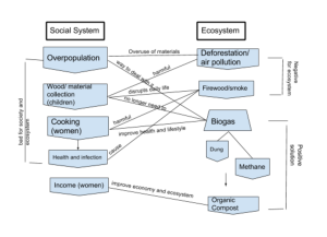
3 thoughts on “Natalie Hall biogas diagram _ MO2”
Leave a Reply
You must be logged in to post a comment.
Hey Natalie! My name is Shanda. Here’s a quick link to my blog! https://wp.me/p3RCAy-b9o
I really like how you included overpopulation into your diagram. Population is a huge factor and it heavily threatens the stability of the environment. Just like you, I also talked about deforestation and job creation because of the use of the slurry. I also like how you have the negative and positive feedback loops within your diagram! It really helps you follow along and see the connection! I enjoyed your post! 🙂
Hi Natalie!
My name is Christianna! Here is a link to my blog entry if you would like to take a look.https://wp.me/p3RCAy-b8r
Your chart first caught my attention because of the organization. I really like that you have it organized into two different columns to show the difference between the ecosystem and the social system. I feel like this makes it so much easier to understand the chart. I also like that you included statements with your arrows to help understand exactly what is happening. You did a great job of organizing your chart!
Hi Natalie,
My name is Humna and here is a link to my post: https://wp.me/p3RCAy-b8w. Feel free to take a look and comment!
We both divided the chart similarly (like many others students, it seems), but I like the groupings you have on the side as well. I couldn’t see the smaller text, but two things caught my eye: your use of “overpopulation” rather than simply population was unique, and the “income (women).” I noticed the latter because I would not necessarily limit that to the women because farmers overall benefited as their incomes doubled as well. Good job overall though!