
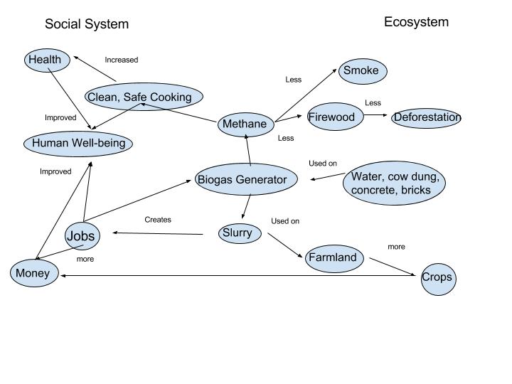
The main focus of my diagram was to show the interconnections and relationships that are formed from human and environment interaction (the relationship between the human social system and the ecosystem). The addition of a biogas generator in an Indian town subsequently changes the entire landscape. The systems diagram created shows how humans and the environment are a coupled system in which the biogas generator provides positive and negative feedbacks. The generator creates methane which leaves a positive impact on both the social and ecosystem. First, it allows for a cleaner and safer cooking environment free off smoke which aids better health and decreases the amount of air pollution. Second, it reduces the need for firewood, which preserves the land and frees up time for children and women that is normally spent collecting the wood. This free time allows children to attend school, eat breakfast, and women to work on other chores which all increases societies well-being. The system also creates slurry that can be used as fertilizer. Women, now with free time are able to compile the slurry and sell it to farmers, benefiting the women through earning money and farmer who uses it on their crops (leading to increased crop production). With more money being earned, an increased crop production and more natural resources preserved, the population carrying capacity can be increased and a higher quality of life can potentially be sustained for a longer period of time.
My diagram is similar to Figure 1.5 in that they both show the chain of effects that result from introducing biogas generators (technology) to an Indian Village. They both illustrate many of the same points: Methane gas leads to less deforestation, increased health an slurry leads to increased crop production, wealth, and environmental resources, etc. Both also separate the impact on the social system and ecosystem. Where my diagram differs from Figure 1.5 is that Figure 1.5 is portrayed in a way where you can visibly see the feedback loops that are caused by the biogas generator. For example, the human population demanding fuel–>which causes them to look for new technology–> which introduces the biogas generator to villiages–> which positive impacts the human population. Figure 1.5 is portrayed in a “big-picture” type of way, showing the feedbacks and the direction of the flow of impacts, while forcing you to think deeper into exactly why the flow and connection between two things occur. My diagram on the other hand more strongly walks the viewer through the cause and the various effects that follow in a systematic (easy to follow, one effect is the result of another effect outcome occurring). I think this is all due to slight differences in perspective taken by both I and the creator of Figure 1.5. I am also new to systemic diagrams while the other creator may have more experience. Non the less it shows how landscapes are mentally constructed based on our individual preferences (ex. where we think the impact lies).
Hello Rob, My name is Megan and I am in Penn State’s architecture program.
I wanted to comment on your graphics because they resemble some of my original attempts to sort this system out. If you’d like to compare our methods feel free to look at my own! http://geog030.dutton.psu.edu/2016/01/24/module-2-biogas-diagram-by-megan-shrout/
I found that by visually showing the feedback loops for many of the components there is an increased understanding of the impacts they have on their environment in your diagram than in Marten’s. Your diagram is similar in that it is biased positively towards BioGas technology, however while yours analyses the feedback loop more carefully, it disregards the aspects in which the BioGas technology improves. Yes it lessens the smoke produced by the firewood, but the reasoning for firewood’s original purpose is discrete in your work. It was a great first attempt at diagraming this system, and I really enjoyed how interdependent the components looked to resemble the intricacies of reality.
Hello, my name is David Youn. I am a Chemistry major that is going to graduate this semester. It was interesting how our figures looked very similar. I have also mentioned job and money. I think this is something that Marten has left out in his figure. I believe that by providing jobs and money to rural areas of India will greatly help them with poverty. It was nice to see that we have much in common with our graphs.