
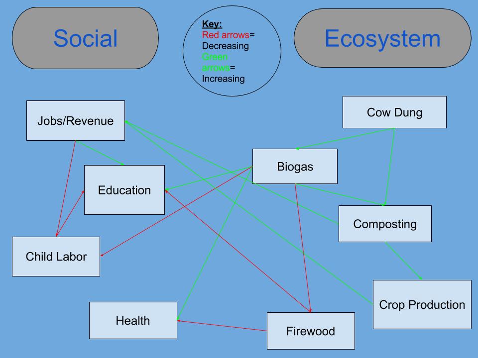
In the clip we watched their main focus was on what was having a negative effect on their society and ecosystem and how they were able to solve this. So I reflected their main focus of what caused a positive effect and what caused a negative effect on their society. The main social ideas they mentioned in the clip were Health, child labor, education, and jobs and revenue. There was also some focus points mentioned in the clip that had to deal with the ecosystem and they were the biogas systems, composting, the use of cow dung, crop production, and firewood. These main ideas all were interconnected with each other and had either effects that increased or decreased the other. The diagram from the reading was both very similar and also very different from my own. This diagram, like mine, had interconnections between the main two categories. However, it was also very different from mine, because there was not crossover effects between the two main categories. For example in my diagram, firewood from the ecosystem side had an effect on health from the social side of the diagram. These similarities and differences exits, because the graphs both contain social interactions and interactions within an ecosystem, and regardless of the the specific focus of the diagram there is always going to cross interactions between the two, because humans are constantly interacting with the Earth and the Earth is constantly interacting with humans. These Diagrams provide a visual of the interactions between humans and the environment, from this visual we can learn about the continuous effects these two systems have on one another and how they create a system together.
Hi, Katie! My name is Melanie and I really liked your diagram! I thought it was really creative how you made a key to describe the different connections between your subtopics. Something I noticed that we did similar was separating the two biggest topics and then creating smaller subtopics underneath of them. I think this makes it easier to understand the overall concept. I think it was really well-done!
-Melanie DeFrancisco
Link to mine: https://wp.me/p3RCAy-b5D
Hey, I really liked the way you created your diagram! I did something very similar with color-coding the positives and negatives in the interactions between humans and the environment. I also think that the point you made about the improved health of the individuals as a very important aspect of the video. Here’s a link to my post if you’re interested! (https://wp.me/p3RCAy-b5c)