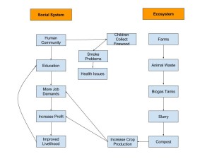
We learned in Module 2 that population has a detrimental impact on the environment. Each area has a certain carrying capacity, so not everyone in that environment will have access to luxury items or items required for survival. In my diagram, I covered the main concepts from the video provided in this module related to both the social system as well as the ecosystem. When comparing my diagram to that of Figure 1.5 from the “What is Human Ecology?” reading, one can clearly see that Gerry Marten and myself had some similar approaches as well as some differences in our diagrams. I took a more broad approach in my categories, such as “Human Community”, whereas Marten broke it down into “Number of Children”, “Human Population”, and “Need for Labour”; however, each of our diagrams share the same idea as to how the biogas tanks in India are effecting the social system and the ecosystem. Everyone has a different view as to which points in the video were key to the biogas of India, so wee will each have a slightly different diagram of what we see. When comparing my diagram to that of Martens’, one can learn that the biogas has had an impact on the number of jobs, women and children in the population, as well as the markets. One can also see that there are more than just their view on the subject, so there is more than what meets the eye.
One thought on “Learning Activity: Biogas System Diagram”
Leave a Reply
You must be logged in to post a comment.


Hey Samantha check out my blog and diagram: http://sites.psu.edu/geog30/2016/01/27/42763/
Great Diagram! Our diagrams are fairly similar, my diagram also alluded to the fact the survival of these people was crucially based on preparation of food. I like how you mentioned the increase in job demands, the way they used a waste and made fuel to cook food. This positive feedback loop is beneficial to the continuance of this tool to survival.