
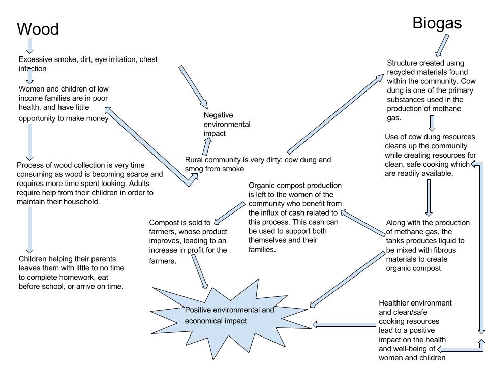
In my diagram I mapped how the use of wood vs. biogas use in cooking both positively and negatively affects the community and the people who live in it. I began by mapping the negative health and environmental impact wood burning has on the community. As mentioned in the video, the use of wood produces both excessive dirt and excessive smoke. This smoke has detrimental health impacts as it irritates eyes and can lead to chest infections. For women and children in low income families, this is a very common occurrence. I followed the progression of this negative impact on health and how it leads to a negative environmental impact, as well as its impact on mental health and stability. As the collection of wood is a time consuming and tedious task, adults need the help of their children. This keeps children from school and their school work, as they have little to no time for anything outside of this process. The environment is negatively impacted by the smoke, the use of the trees for wood, and the cow dung present in excess. I then switched my focus to the more positive impact that the use of biogas is having on the environment and the health of the citizens living within the community. Biogas eliminates some of the natural resources (cow dung) that make the community unclean and unsuitable, while creating methane gas for safe and clean cooking. This makes an economical impact in that the production of such gas leaves behind the materials with which to produce an organic compost. This compost production creates job opportunities for low income women, as well as increases profit for farmers whose product is improved by such compost. My diagram differs from the image shown as while in that diagram many of the elements are connected, my diagram follows two separate paths connected to the factor preceding or following itself.
Hi there. My name is Syed Amirul and I am an economics major, currently in my senior year. To be honest, I was attracted to your blog entry because of your explosion-like shape that you used lol. But upon taking a closer look at it, I think it’s pretty great and different. You took a different path by starting the chart with the negative impacts of burning the wood and work your way towards the biogas cycle almost chronologically. I also find it easier to understand when you used explanations as points connecting one to the other. Feel free to go through my entry if you’d like. Thanks!
http://geog030.dutton.psu.edu/2016/01/27/42859/
Hello,
My name is Jiye Choi. I’m junior in energy engineering.
your diagram seems very different with my diagram. I think your diagram is very detailed and lots of words.
First it is unique that you started with wood and biogas this is the biggest difference between your and mine. I think your diagram is very nice. But in my opinion, diagram should be simple. so what about use words instead of sentences.
http://geog030.dutton.psu.edu/2016/01/27/learning-activity-2-jiye-choi/ here is my blog link if you want to see the difference.
by the way, you should’ve posted in M02 instead of M01 I hope you find this out before due.