
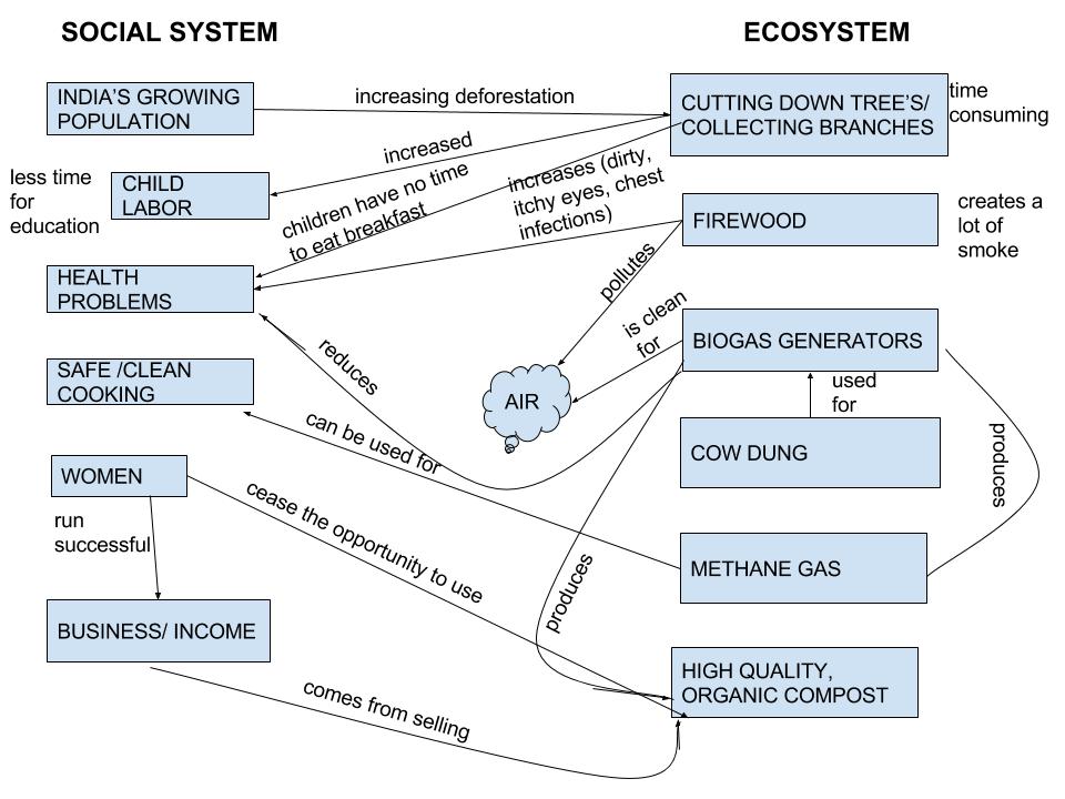
Within my diagram, there are core ideas that were learned from reading Module 2. From the Population, Affluence, and Technology tab, also known as the IPAT equation, the famous inventor Kurzweil argues about the point “T” in the IPAT equation. As he believes, some technology can increase environmental impacts while other technology can decrease it. You can see this concept within my India diagram. Under the ecosystem side, you can see that firewood is a concept that increases environment impacts by creating a lot of smoke and causing health problems amongst the citizens of India with dirty air, itchy eyes, and chest infections. However, introducing the biogas generator decreases the environmental impact by reducing health problems since it is clean for the air, as well as producing methane gas, which allows the women of India to use safe and cleaner cooking. The biogas generator also produces high quality, organic compost that women in India cease the opportunity to use, bringing in successful business and more income. Before the biogas generator, India’s environment was relatively unstable because it had a lot of disturbances. However, with the introduction of the biogas generator, India can now be considered relatively stable, due to fewer disturbances from deforestation as well as the firewood’s smoke.
Compared to Figure 1.5 in the Marten reading, “What is Human Ecology?,” my diagram has some similarities as well as differences. Some of the similarities are under the ecosystem side, being that both diagrams have concepts of deforestation, animal dung, and biogas generators. The concepts are very important because they are what is hurting/improving India’s economy and ecosystem. Differences between the two diagrams are the arrows and the short phrases that explain the nature of the interactions. These are differences also because I have different ideas on my social system side than figure 1.5. Between the two comparisons, we learn that there can be many different diagrams created by the way an individual interprets the information. Some diagrams can be very detailed and in depth while other diagrams can be basic with less information.
Hello, I’m Brenton. I enjoyed both your in depth post and the unique way you presented ideas in your diagram. While reading through the posts for this week, I found that most of the diagrams were very similar to the diagram we needed to compare them to. While your diagram does follow the format, the core ideas are presented in a way that differentiates it from the other. In addition, I appreciated the way you went into detail about Kurzweils argument. I drew the same conclusion but after reading your post I feel that I may have not done this point justice. I also enjoyed the attention you gave to the specifics of time and health as they relate to the two systems. I think was an important part of your analysis and will now try to think more in depth about these issues in the future.
Here is a link to my post:
http://geog030.dutton.psu.edu/2016/01/25/biofuel-brenton-mcdonald/