
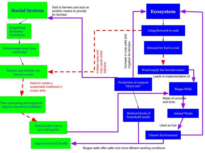
The main focus of my diagram was to illustrate the importance of the relationship between the social system and the ecosystem, as together they can positively or negatively affect several aspects of life. For example, the ecosystem was negatively affected by the use of firewood as it emits smoke into the air. At the same time, people were contracting chest infections as well as irritation of the eyes due to that same smoke emission. My biogas diagram clearly indicates that an initial ecosystem complication can lead to widespread complications within the social system as well. Such negative affects are shown with dashed red lines in the biogas diagram. Alternatively, once the biogas wells were implemented, the ecosystem benefited as there was in increase in crop yield and irrigation for farming. The biogas wells also made use of animal waste as fuel, leading to a cleaner ecosystem, which in turn lead to safer and more efficient working conditions. The improved working conditions lead to an enhancement in public health status. This type of “win-win” scenario is also depicted in my biogas diagram with solid purple arrows. Overall, the core idea behind my diagram is a representation of feedback mechanisms. There are both positive feedback loops (solid purple) and negative feedback loops (dashed red) interacting with each other at all levels of the ecosystem and social system. With that in mind, a positive action within a social system can therefore lead to a beneficial change within the ecosystem. This is especially important as our ecosystems have been overwhelmed with negative changes due to global warming.
My diagram is similar to Figure 1.5 in the Marten reading as we both made use of solid lines and dashed lines to represent various feedback mechanisms. Both of our diagrams illustrate the concept of cause and effect between social systems and ecosystems. Our diagrams differ based on the broadness of the category. My diagram focuses mainly on the direct effects of firewood on health and lifestyle, whereas the Marten diagram covers a vast range of effectors such as the overall population, especially children, to technological aspects. These differences can be attributed to the level of detail each diagram possesses as well as which end of the spectrum each is focused on. The major emphasis in my biogas diagram is the chain of events leading to the implementation of the biogas well. The diagram from the Marten reading is focused on the effects after the biofuel generator is introduced to the village. Through comparison of both diagrams, it is clear that social systems and ecosystems depend on each other and a change in one leads to a change in the other, whether that change be positive or negative.
Hi Katherine! You did a really nice job on your diagram, everything is clear and in depth. I love how you included how the tech boom draws people away from rural areas, that is something I didn’t think to put on my diagram, but it is such an important factor! Your connections are also super thought out and well done. I also liked how you explained your thought process for the different colors and different lines. I color coded my diagram as well!
Here is a link to my post:
http://geog030.dutton.psu.edu/2016/01/27/katie-cuerou-biogas/
Hi Katherine here is a link to my blog post https://wp.me/p3RCAy-b4V. Your system diagram covers the social system and ecosystem in India very well. I like how you included how the tech boom is driving people away from the rural areas. The diagram is very easy to follow and understand due to the different colors used. I was at first confused about the different colored lines, but your explanation does a good job at clearing it up.