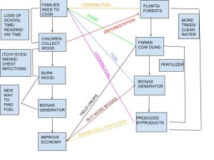
SOCIAL SYSTEM ECOSYSTEM
In my diagram, I wanted to focus on the coupled human-environment interactions in more detail. For example, I thought it was important to discuss the effects of picking up wood on education and deforestation. By looking at the systems in more detail, I noticed some positive and negative feedback loops. In terms of the economy, biogas generators produce fertilizer which the women in the town can sell. Due to the increase in money, more families can buy more generators, leading to even, more money (positive feedback loop). On the other hand, biogas generators push families away from picking up branches, leading to a decrease in deforestation (negative feedback loop). As I compared my diagram to Marten’s in the reading, I noticed we had some things in common. We both discussed farms, forests, fertilizer and cooking oil. However, in my diagram, I focused on the problems associated with health, education, and the economy. Additionally, we differed as I did not have branches discussing the human population and how generators could affect the number of children families had. There are similarities between our diagrams because we both mentioned crucial points about the purpose and significance of biogas generators. However, there are differences because I spent more time breaking down the relationships in great detail while Marten made the important broad connections. By comparing the two diagrams, viewers might not have thought about how biogas generators can increase wealth (economy) for women and farmers in the town.


Hi Amanda, My name is Eunice! I really liked how you explained about the positive and negative feedback loop. I didn’t focus on the feedback loops and you did give me some great ideas I can use further on. I thought your diagram was really good and organized! I liked how you used different colors to make it easier to see the connection between. Compared to my diagram, I think you focused more on the social system like the education and health. I focused more on the ecosystem since there were few more connections explained in the video. This is my blog entry! http://geog030.dutton.psu.edu/2016/01/26/module-2-biogas-in-india-2/
Hi Amanda! Great diagram! I really liked the use of different colors, it made it easier to follow. I set my diagram up in a similar manner to yours, but you included some extra detail that was really helpful to a viewer. For example, on the far right side, the text boxes that described the problems associated with education and health were very descriptive, but still did not distract from the other points. I was not quite sure where to put that information in on my diagram. Feel free to check mine out and see how I set it up. https://wp.me/p3RCAy-aZc
-Sophia