
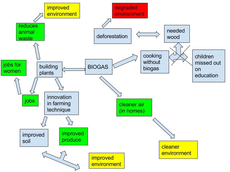
As I was creating this diagram, I really wanted to make sure each of the aspects, environmental degradation, environmental improvement, and social improvement were all highlighted as the main focus. First of all, I chose to color-code these three categories; degradation is red, environmental improvement is yellow and social improvement is green. Also, on the left side, there is a section with an “x” through it; this is what will no longer happen due to the involvement of biogas systems in these communities. I think that the idea of biogas introduced through the video was very interesting and related to our course objectives well. For example, a positive feedback was introduced in the form of cooking without biogas. The families needed wood to make food, however, there was very little wood, and the children had to skip school to find it. Because so much wood was being harvested, the environment was not able to support so many people, but because the children were not receiving enough education, they were not able to move out to the cities to find work. And the trend continued, the social and environmental aspects continuing to become degraded. However, with the addition of biogas, it is hoped that the woods will demonstrate their resiliency and bounce back instead of possibly becoming a new stable state.
In the Marten reading, he strictly divides his diagram between environmental things and social aspects, but in mine, I chose to mix them all together, as it actually is in reality. Although they look different, both of our diagrams include many of the same aspects of both sides
.
Hi Rebecca,
My name is Cassie and this is the link to my blog entry: http://sites.psu.edu/geog30/2016/01/27/cassie-hess-biogas-system-diagram/. Your systems diagram really caught my attention because of your use of color. I also used color in my diagram in order to categorize the systems. I think it’s interesting how you chose the category of degradation. Your use of multiple arrows to show the cause and multiple effects of some of the factors is really helpful. Good job!
Rebecca,
Great job on your diagram. It is kinda easy to get carried away with how much any change in the system invariably changes another! I think I could have honestly made several pages worth of cause and effect based on the generator alone! Great job!